Introduction
Recently I got the chance to play with Material’s BackdropScaffold. In short, a Backdrop Scaffold is a view component containing 2 layers: A back layer and a front layer. I won’t go too deep into it’s definition and anatomy but for those interested, read through these links before continuing or refer to them as you go through the article:
- Backdrop Anatomy
- Api documentation
- Jetpack compose example (I’d suggest going through this as it explains the basics pretty well)
- Landscapist’s CoilImage
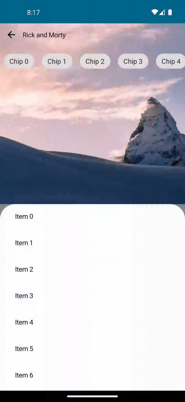
For this article, we’ll be building the following example and be focusing mainly on the animation and positioning:
Anatomy
Let’s start off with the anatomy of the layout. The back layer consists of 2 views: An app bar and an image. The backdrop scaffold has a slot for the app bar but we won’t be using it since it doesn’t support overlapping the app bar over the back layer out of the box.
To work around this, we’ll place the app bar in the back layer and handle the peek height of the front layer manually. We’ll also focus on the smooth transition between the back layer and front layer (especially the front layer’s corner radius transformation) so that it appears seemless.
Back layer components
The components in the back layer are pretty simple but to explain them briefly:
- A custom app bar which contains a back button, a title and a carousel below consisting of chips
@OptIn(ExperimentalMaterialApi::class)
@Composable
private fun AppBar(onBackPressed: () -> Unit, modifier: Modifier = Modifier) {
    Column(
        modifier = modifier
            .fillMaxWidth()
    ) {
        Row(
            horizontalArrangement = Arrangement.SpaceBetween,
            verticalAlignment = Alignment.CenterVertically,
            modifier = Modifier.fillMaxWidth()
        ) {
            IconButton(onClick = onBackPressed) {
                val drawable = painterResource(id = R.drawable.baseline_arrow_back_24)
                Icon(painter = drawable, contentDescription = "Back button")
            }

            Text(text = "Rick and Morty")

            Spacer(modifier = Modifier.weight(1f))
        }
        LazyRow(modifier = Modifier.fillMaxWidth()) {
            items(20) {
                Chip(onClick = { /*TODO*/ }, modifier = Modifier.padding(8.dp)) {
                    Text(text = "Chip $it")
                }
            }
        }
    }
}
- An image which fills the back layers completely (using Landscapist’s Coil-support api):
@Composable
private fun RandomImage(modifier: Modifier = Modifier) {
    CoilImage(
        imageModel = { "https://fastly.picsum.photos/id/866/1200/1200.jpg?hmac=K6GoAw2chutb9SAS0on4KTAvrMzFtj_FNdVbhv1D5ys" },
        imageOptions = ImageOptions(
            contentDescription = "Character Image",
            contentScale = ContentScale.FillBounds,
        ),
        component = imageComponent {
            +CrossfadePlugin(duration = 550)
        },
        modifier = modifier.fillMaxSize()
    )
}
Front layer components
The front layer is even simpler and contains only a list of 50:
@Composable
private fun FrontLayerContent() {
    LazyColumn(
        modifier = Modifier
            .fillMaxSize()
            .padding(top = 16.dp, start = 16.dp, end = 16.dp)
    ) {
        items(50) {
            Text(
                text = "Item $it",
                modifier = Modifier
                    .fillMaxWidth()
                    .height(56.dp)
                    .padding(horizontal = 16.dp)
            )
        }
    }
}
Scaffold state
Backdrop scaffold state contains a couple of convenient apis which let’s you know whether the scaffold’s back layer is concealed or revealed as well as a way to manually change the state. It also extends SwipeableState which we will use down the road to calculate the scroll progress. In this example, we’ll create a scaffold state with an initial state of revealed:
val scaffoldState = rememberBackdropScaffoldState(BackdropValue.Revealed)
Animation
To achieve the animation we want, we need to calculate the alpha to control the transition animation of the image and the app bar. While scrolling the front layer to full height, we need the image in the back layer to change from opaque to transparent and the app bar to change from transparent to opaque. So one will use the alpha outright and the other will use the exact opposite of it.
So the first step is to calculate the scrolling progress. Swipeable has an api called progress which starts at 0 and ends at 0. I know this sounds weird but 0 indicates that no scrolling event is ongoing. While scrolling, it will go from 0 to 1 but once scrolling stops, it will immediately reset to 0. In our case, we need the alpha to be between 0 and 1 but given that the progress never stops at 1, we’ll need to manually set this as so:
/**
 * Calculates the current fraction based on [androidx.compose.material.SwipeableState]'s progress and assures that it aligns properly between 0 and 1.
 * Fraction always starts at 1 and ends at 0 for every state change.
 * With a little math, we can make it so that:
 *
 * - Expanded → 0f i.e Opaque
 *
 * - Collapsed → 1f i.e. Transparent
 */
@OptIn(ExperimentalMaterialApi::class)
private val BackdropScaffoldState.currentFraction: Float
    get() {
        val fraction = progress.fraction

        return when {
            currentValue == BackdropValue.Concealed && targetValue == BackdropValue.Concealed -> 0f
            currentValue == BackdropValue.Revealed && targetValue == BackdropValue.Revealed -> 1f
            currentValue == BackdropValue.Concealed && targetValue == BackdropValue.Revealed -> fraction
            else -> 1f - fraction
        }
    }
In this example, the image will use the alpha directly and the app bar will use the opposite of the alpha:
val alpha = remember(scaffoldState.currentFraction) { mutableStateOf(scaffoldState.currentFraction) }

val navigationHeaderAlpha = remember(alpha.value) { abs(alpha.value - 1f) }
The alpha is also used to properly calculate the size of the corner radius for the start, end and transitioning states as so:
private const val FRONT_LATER_CORNER_RADIUS = 32
//
val frontLayerCornerRadius = remember(alpha.value) { FRONT_LATER_CORNER_RADIUS * alpha.value }

val shape = MaterialTheme.shapes.large.copy(
    topStart = CornerSize(frontLayerCornerRadius.dp),
    topEnd = CornerSize(frontLayerCornerRadius.dp)
)
Front layer peek height
Given that we won’t be using the slot for the app bar, the scaffold won’t help us in terms of placement and the peek height of the front layer. The placement is simple but the peek height is a little trickier since we need the front layer to stop right below the app bar for the final state to look clean.
To make this work, we need to calculate 2 things:
- The size of the app bar
- The remaining screen size
For the size of the app bar, we can get the size with onSizeChanged modifier provided by compose (FRONT_LAYER_PEEK_HEIGHT doesn’t have any major significance here. Feel free to substitute this with a value that makes sense to you):
private const val FRONT_LAYER_PEEK_HEIGHT = 56f
//
val frontLayerPeekHeight = remember { mutableStateOf(FRONT_LAYER_PEEK_HEIGHT) }
//
AppBar(
    onBackPressed = onBackPressed,
    modifier = Modifier
        .onSizeChanged { frontLayerPeekHeight.value = it.height.toFloat() }
)
For the remaining screen size, we can get the screen size via LocalConfiguration and subtract by the app bar size and add the top window insets:
val headerHeight = LocalConfiguration.current.screenHeightDp - BACKDROP_HEIGHT

// Values used for calculating max height of the front layer
val statusBarInset = WindowInsets.systemBars.asPaddingValues().calculateTopPadding()
val frontLayerPeekHeight = remember { mutableStateOf(FRONT_LAYER_PEEK_HEIGHT) }
val finalPeekHeight = (frontLayerPeekHeight.value / LocalDensity.current.density).dp + statusBarInset
Final scaffold view
We went through the individual components, calculating the scroll progress which in turn is the alpha, calculating the corner radius for the front layer and handling the peek height of the front layer so that it stops right under the app bar.
1 more thing to keep in mind here is that the scaffold component sets a scrim color over the front layer which makes the front layer appear disabled or disables interactions outright. To disable this, we set the frontLayerScrimColor as Color.Unspecified so that users can interact with the front layer while the back layer is revealed.
Here is what the final scaffold looks like:
Final thoughts
While it’s pretty nice, there were a couple of things that bothered me:
-
Internally, the scaffold contains a scroll threshold in which the animation doesn’t kick in unless the threshold is exceeded. This leads to the animation not being entirely smooth but it’s not as apparent to the naked eye.
-
The scaffold doesn’t allow the front layer to overlap with the back layer. This is an issue because depending on the image, the background which is exposed by the corner radius can’t be guaranteed to blend seamlessly.
Overall, BackdropScaffold is still experimental but it’s very convenient and simple to use and both the api documentation and the design anatomy is very detailed. Give it a try and let me know what you think.